| 精华 | |
| 金钱 | BA |
| 威望 | 点 |
| 贡献值 | 点 |
| 爱心 | 点 |
| 经验 | 点 |
| 注册时间 | 2012-11-7 |
| 最后登录 | 1970-1-1 |
| 在线时间 | 小时 |
| |
| |
| |
|
立即注册,加入爱黑武论坛的大家庭!爱黑武,爱上搞机生活!
您需要 登录 才可以下载或查看,没有账号?注册

x
本帖最后由 Anderson 于 2014-12-6 08:49 编辑
Nexus 6 review
Nexus 6评测
Go bigger or go home
要么更大,要么不干
By Dieter Bohn
作者Dieter Bohn
2014年11月12日
英文原文链结
http://www.theverge.com/2014/11/12/7200705/nexus-6-review
Phablet.
平版手机(Phablet)。
It's the worst word, a word only spoken with an apology — or maybe with a proviso. "I hate saying this word, but it's the only way to describe this thing." But it's just a word. And like all good words, it accurately connotes the thing you want to reference. It's more economical than "gigantic phone" and, honestly, more accurate. A phablet is not a phone; it's something else.
它是最差的词语,它是一个需要我一边讲一边觉得不好意思,或者可能加上附加条件的词语。我讨厌用这个词,但只有这一个字可以用来形容这件物品。但,它也不过是一个词语而已。就如其他好的词语一样,它准确地引伸出你想形容的东西。它比说「巨型手机」更省时(英文是Gigantic phone),诚然,表达得也更为准确。平版手机不是手机,它是另一样产品。
In fact, there's a certain satisfaction in using it. When a word not only refers to a thing but also itself feels just as unwieldy as that thing, that is a good word. A powerful word, a word that gets things done and isn't worried about how silly it looks doing it.
事实上,採用这个字词的效果也颇为令人满意。当一个字不单单用来形容一件物品,更能使人感受到好像那项物品那么笨拙的话,它是一个很好的字、一个有力量的字,一个能解决使用需要而且也不用担心用起来有多难看的字。
The Nexus 6 is a phablet.
Nexus 6是一部平版手机。
It's also the showcase for the newest version of Android, 5.0 Lollipop. As with other Nexus devices, it will likely be one of the only phones to run Android without extra, unwanted software you get from carriers and manufacturers. That's a big deal for some people. Assuming you aren't put off by the size or the $649 off-contract pricing. Assuming that you don't really want just a phone.
它也是用来展示最新的安卓系统Android 5.0 Lollipop的手机。就像其他的Nexus产品一样,它很可能成为极少数使用纯原生安卓系统的产品之一,没有任何来自营运商或者生产商的额外或者多馀的软件。对一些人来说,这是很重要的。假设你不被它的体形或者它的非合约价649美元吓到,或者假设你想要的不只是一台手机。
Because the Nexus 6 isn't a phone. It's a phablet.
皆因Nexus 6不是一台手机,它是平版手机。
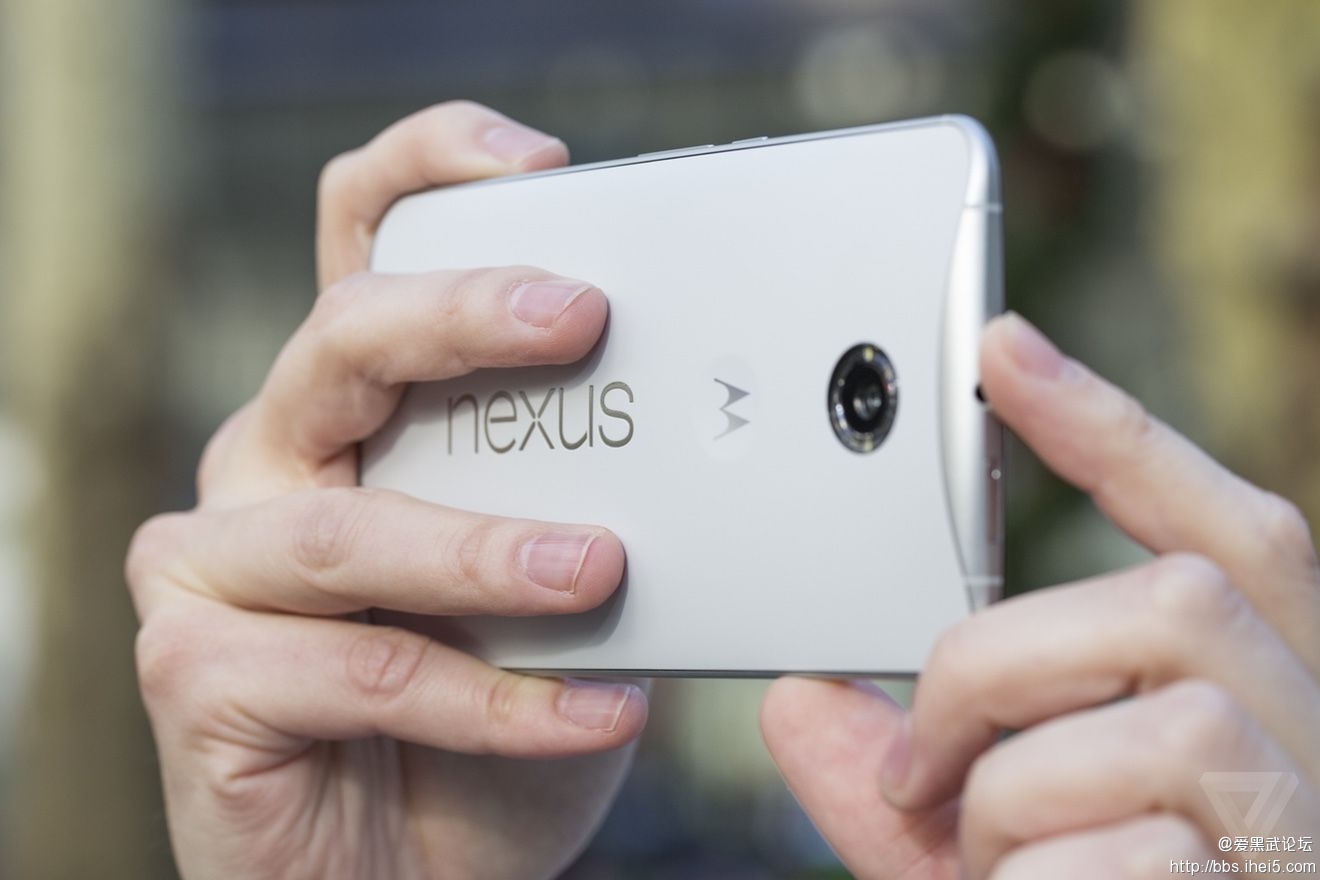
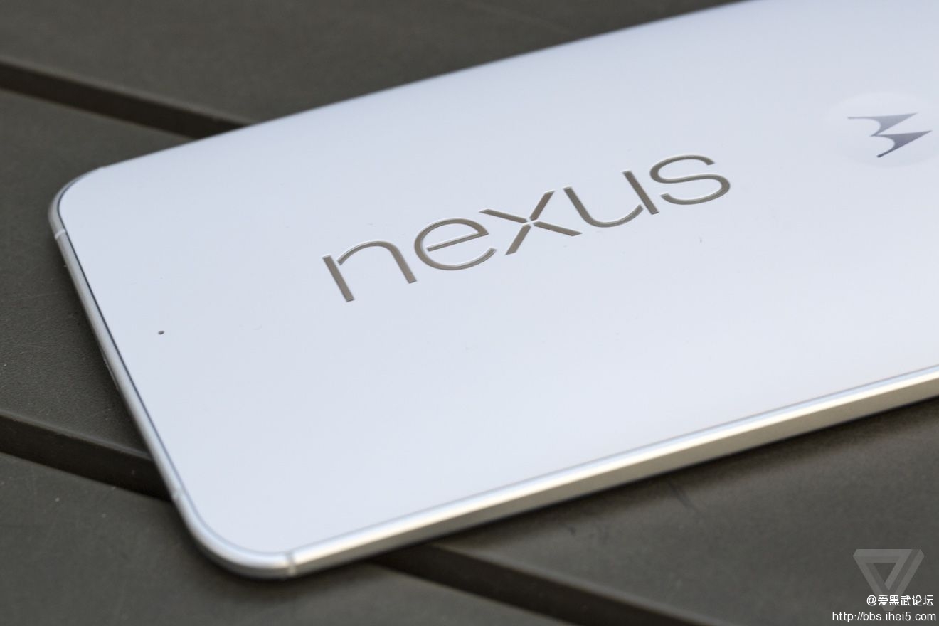
The Nexus 6 is taller, wider, and thicker than either the iPhone 6 Plus or the Samsung Galaxy Note 4. That's in large part because the Nexus 6 has a larger screen, at about 6 inches diagonal. It's also pretty thick, sloping from a thinner edge around the bottom and sides to 10mm near the top. The Nexus 6 is essentially a blown-up version of the Moto X, and so it shares almost all of its design language.
Nexus 6比iPhone 6 Plus或者三星Galaxy Note 4都更长、更宽、更厚。主要是因为Nexus 6有更大的屏幕,屏幕对角线大约是六英寸长。它比较厚,从底部较薄的边沿开始逐渐变至接近顶部处的10mm。Nexus 6基本上就是放大版的Moto X,因此Nexus 6拥有几乎所有Moto X的设计语言。
I'm not sure I agree with that design choice. Both phones have a gentle curve on the back and a nice "dimple" in the center where you can rest your finger. The two combine to make a device that is designed more to nestle in your hands than feel slim in your pocket. There's something admirable about Motorola's clear and consistent design vision for its devices, but at this size it starts to break down. I can't help but wonder whether there's wasted space inside it.
我不能肯定我喜不喜欢这个设计。两款手机的背面都拥有微弯的弧度和中央一个「小酒窝」来放置你的手指。这两点都令手机更适合安置在你的掌心而稍为牺牲了放在裤袋时的纤薄感。摩托罗拉设计的简洁和一致性是值得嘉许的,但它的大小开始失控了。我忍不住在想到底裏面浪费了多少空间。
IT FEELS GREAT IN TWO HANDS, NOT SO MUCH IN ONE POCKET
两手使用时感觉得好,但单手时就不太好了
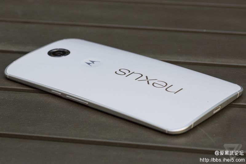
Unlike the Moto X, the back on the Nexus 6 is plastic, I have the white model that is probably best described as having an "eggshell" kind of feel and color. It's smooth without being glossy and so far has resisted both scratches and discoloration. The power and volume buttons are thankfully located in a humane position on the right of the device, reachable with your thumb. It looks a little weird, and I still hit the wrong button sometimes despite the differentiated etching on the power button, but it works.
不像Moto X,Nexus 6的背面是用塑胶做的,我很不喜欢白色版本,它的手感和色彩简直就和蛋壳一样。它很滑而不会反光,暂时仍未有划痕或者染色。好在电源和音量按键都放置在一个很人性化的位置,在机身右侧让姆指很易接触得到。它看起来有点怪,即使已经够清晰了但我有时仍会按错按键,好在也不太影响使用。
Just so I'm super clear: the only time you can really use this phablet one-handed is when you're just scrolling through a web page or an ebook with your thumb. For everything else, accept that it's a phablet and you're going to use two hands.
我一定要强调这一点︰唯一你能够单手使用这台平版手机的情况就只有使用姆指来拉动网页或者电子书的时候,除了这两个情况以外,你一定要接受它是平版手机的事实,你需要两手并用。
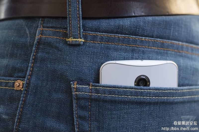
A GIGANTIC MOTO X
一台巨大的MOTO X
Unlike its smaller sibling, the Moto X, the Nexus 6 has two front-facing speakers. They are loud. Once I accidentally put the phone up to my ear when Google Now was about to speak in its Outside Voice, and I near damaged my eardrum. Still, these won't replace your Jambox: at high volumes it can begin to sound a little tinny. But if the only phone that beats you in terms of sound quality and volume is the HTC One M8, you're in good company.
和它的小型亲戚Moto X不一样的是,Nexus 6具有两个前置的扬声器。它们很大声。有一次我意外地将手机放近耳朵而Google Now正好在室外的模式,我几乎被吵得耳朵都聋了。当然,它们不能代替你的Jambox,在高音量时声音会有一点细弱无能。但如果对你来说音质和音量都能令你完全满意的手机是HTC One M8的话,你找到另一个好的选择了。
Let's get back to the screen, whose size is really the whole reason for this phone's existence. The resolution on the 6-inch screen is 1440 x 2560, which at 493ppi sits between the iPhone 6 Plus and the Note 4 in terms of pixel density. But whatever, the pixels are tiny and even if you go hunting for them, you won't find them. Crazy world we live in, but this kind of "Retina Plus" pixel density is table stakes now.
不如回到屏幕上吧!屏幕的大小自然是Nexus 6存在的最大价值。这个6英寸屏幕的解析度是1440x2560,493ppi的像素密度使它处在iPhone 6 Plus和Note 4之间。但无论如何,这些像素点已经小得无论怎样也是看不出来的。我们就是活在如此疯狂的世界裏,但这个「后Retina」年代大家都要为像素密度下最大的赌注了。
Living with a giant-screened phablet takes some getting used to, but it’s nearly impossible to go back once you do. So many of the foibles of smartphones become lessened or eliminated simply because there’s simultaneously more space on the screen and many of those things are bigger and easier to tap. It’s easier to show stuff on your phone to other people, it’s easier to turn it into a reading and movie-watching gadget, and it’s way easier to type on.
与一台巨屏的平版手机一起生活需要一些时间来适应,但当你适应之后你又无法回去以前的世界了。很多智能手机的小缺点都被更大的屏幕空间降低或者彻底解决了,很多东西都变得更大更易按中。现在很容易用手机来展示东西给别人看、也很容易将它变成一个阅读器或者电影阅览工具,也更容易打字了。
The screen is very good, but it also comes with its own peculiar set of tradeoffs. Tuning the color on AMOLED screens to match what most people actually want is notoriously hard, and, to its credit, Google has landed on settings that don't oversaturate colors or look too dim. Nitpickers will notice a very subtle color shift when you tilt the phone left to right, especially on whites. If you’re a nitpicker, there’s your barely-visible-to-the-eye nit.
它的屏幕非常好,但它也存在一些特殊的问题。要将AMOLED屏幕调得适合大部分人的口味是很困难的,谷歌已经调整得不会令颜色过浓或者太暗了。吹毛求疵的人会在左右倾斜手机时看到很小的色彩变化,尤其是白色的部分。如果你是这一种人,这个就只是你唯一勉强可以找到的缺陷了。
But that's a tradeoff I'm willing to make to get a new feature in Lollipop called "Ambient Display" that pops up your notifications as they come in without powering on the entire screen. It’s essentially an extension of what Motorola did before, but on stock Android it just shows your entire lockscreen - albeit in black and white, which saves power.
但作出这小小的牺牲来换取Lollipop中新的Ambient Display(环境显示)是十分值得的,这个新功能就是不用亮起整个屏幕即可显示你的通知。基本上它是摩托罗拉以前做过的延伸版本,但在这个原生安卓介面中它能在整个锁屏画面中显示,即使它为了省电只得黑白色。
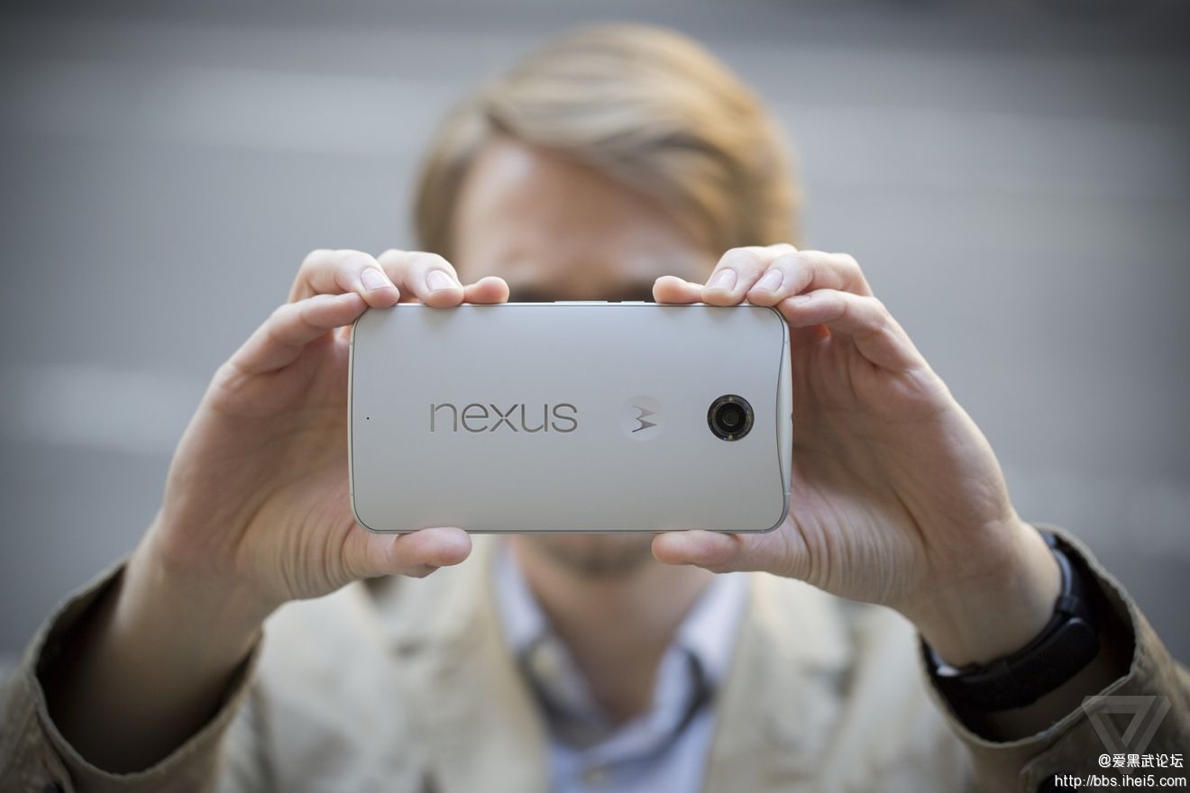
Battery life is good by phone standards, but maybe only fair by phablet standards. The Nexus 6 has a 3220 mAh battery, which in my week or so with the device initially lasted a solid day and a half. Very heavy use did make it die out after 14 hours or so, while lighter use let me push it to two days. I'd say that battery life seems a little inconsistent, but really I can’t judge yet even after a week of using it. For one thing, the software may not be final, but the real problem is that I’m just seeing completely different results day by day.
以手机的标准来说它的电力不错,但以平版手机来说只是一般。Nexus 6的电池是3220mAh的,在我试用的一星期中最初可以达至一天半的成绩,而大量使用就可以用十四小时左右,少量使用就勉强可用两天。我觉得电力表现不太稳定,但即使过了一个星期我也不能得出结论。也许因为软件版本不是最新的,但我的确每日都见到不一样的效果。
The bottom line, though, is that you shouldn’t have a problem lasting through an entire day — for a phablet, I’d like to see that the number consistently reach into the next morning. There is a battery saver mode (finally) built into Android now, which limits some features and turns off background data. It also turns the menu and button bars an aggressive shade of orange. If you happen to have the included fast charger (or anything that can pump out more voltage than a standard USB charger), you can add a few hours of charge in just 15 minutes.
底线是,你想使用一天的话绝对没有问题。只是作为平版手机,我期望可以稳定地使用多半天时间。它(终于)提供了内置在安卓系统的省电模式,它会将部分功能限制和关闭背景资料。它也会将目录和按键栏变成侵略性的橙色阴影。如果你正好有它的快速充电器(或者任何比一般USB充电器更高伏特数的东西),你就可以在15分钟之内增加数小时的使用时间。
ALL DAY BATTERY, BUT MAYBE NOT MUCH MORE
一整天的电力,但也许不太多
If I have any complaints about the performance of the Nexus 6, they hopefully stem from the fact that I'm not yet using the build of Android that will come on retail devices. Everything from scrolling to app launching to games is mostly smooth and snappy thanks to the 2.7GHz quad core Snapdragon 805 processor and 3GB of RAM. That is, everything is fast until it's not — I'm getting intermittent and infuriating pauses in certain tasks. The new multitasking "Overview" screen and the camera in particular can inexplicably lag for a second or more. Google's Android team assures me that this is not normal, and I'm dearly hoping they're right: excepting those pauses, the Nexus 6 is super fast. (An OS update was pushed out the night before this review was published, but I haven’t received it yet.)
如果我对Nexus 6的性能有任何投诉的话,希望只是因为我用的版本不是零售版。包括拉动和打开应用程式的任何操作都大致畅顺和爽快,这是得益于2.7GHz速度的Snapdragon 805四核处理器和3GB的RAM。一切都很快,直至间中在某些操作时会间歇性地出现令我生气的停顿。新的「Overview」画面和相机会出现一秒以上难以理解的停顿。谷歌的安卓团队向我表示这点肯定是不正常的,我也希望他们的说法是正确的︰除了这些停顿以外,Nexus 6是超级快(在写出这篇评测前一晚就有一个软件升级出现,但我仍未收到)。
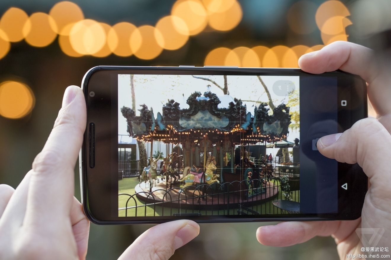
My initial impressions of the camera were that it was the best that's ever shipped on a Nexus device. After using it quite a bit more, I can unequivocally say that's true. But that's also not saying very much, since past Nexus cameras have been consistently bad. This 13-megapixel sensor seems like it's identical to the one found in the 2014 Moto X, but with stabilization.
我最初对相机的印象就是,这是Nexus产品史上最好的一个。经过更多的试用,我就可以更明确地说出这句话了。但我也不会再说下去,因为过去的Nexus产品的相机都是很差的。这个1300万像素的感光元件似乎和2014 Moto X是一样的,但加上了防抖。
THE CAMERA APP FEELS A LITTLE SPARTAN
相机应用程式有点简洁
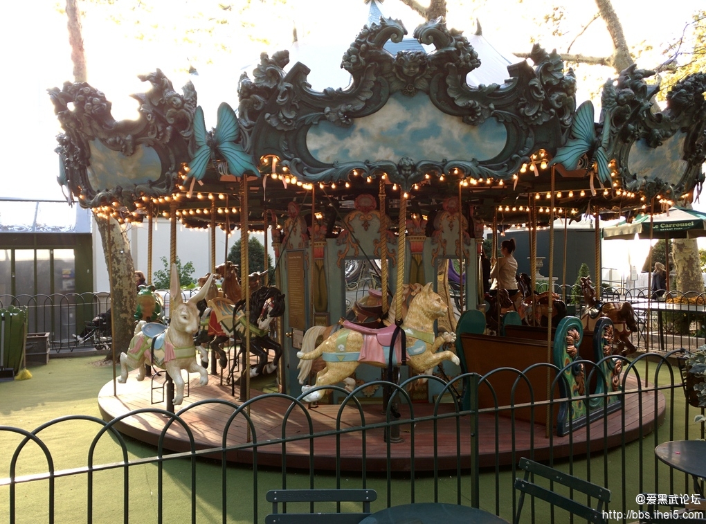
In good light, it's able to get shots decently fast and the results are sharp. But even with OIS, low light can be a little bit of a challenge — though again, even a thoroughly average phone camera is 2014 is a win if you're grading on the Nexus curve. It doesn't hold up to the best that Samsung and Apple can do, but it shouldn’t cost you many shots either. One thing I find curious is the Google Camera software, which lacks features like slow motion video, time lapse, and all those built-in image effects. Theoretically, the new APIs that Lollipop gives to developers will mean that a third-party camera app will be able to fill in those gaps, but it would still be better just to have them in the default app.
在好的光线下,它可以很快地拍摄,图片也很清晰。但即使加上了光学防手震,在低光线之下拍摄仍然是一项挑战。再一次,在低光下即使是普通的2014年手机和Nexus比起来都是会胜出的。它没有达到三星或苹果最佳的水平,但也不会浪费你太多的照片。我好奇的是谷歌的相机软体,它欠缺了包括慢镜摄录、延时摄影和那些内置的相片效果。因此,Lollipop会给予开发机会,令第三方的相机应用程式可以补充一下这些不足,但在原有的相机应用程式内置这些功能会更好吧。
NEXUS 6 SAMPLE PHOTOS
NEXUS 6试片


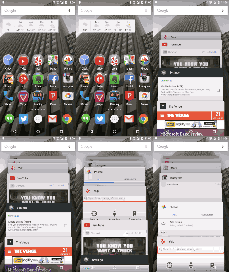
Android 5.0 Lollipop is the biggest change to the operating system in years, thanks to a complete visual overhaul and a giant pile of little features. It’s a lot like what Apple did to iOS last year with iOS 7. Lollipop is based on a concept called "Material Design", which imagines a world of magic paper underneath your screen. It consists of cards, textures, and buttons that will be familiar to anybody who has used Google Now — plus an incredibly bright and vibrant set of colors that are a wild departure for Android. You could call it skeuomorphism if you really wanted to, but the reality being imitated here is more Oz than Kansas.
安卓5.0 Lollipop是过去几年内安卓系统最大的一次改变,包括视觉上的全新设计和一大堆小改变。这有点像苹果iOS上年对iOS 7做的一样。Lollipop是基于一个叫做「Material Design」的概念,即是想像在屏幕之下有一个魔术纸的世界,当中包含有用过Google Now的人都很熟悉的卡片、质地和按钮,再加上和以往安卓系统截然不同的鲜艳和有生气的颜色配搭。如果你想的话你可以称之为彷制,但现实是被模彷的更像Oz而不是Kansas(这句话我完全无法翻译了)。
Essentially, there are no more panes of virtual shadowed glass and neon outlines in Android anymore. Apps (and even browser tabs) become giant cards in an overview, the apps button on the home screen grows out to become a sheet of paper on which your programs sit, and compose buttons float around on the bottom of the screen.
本质上,在安卓系统中已经不再有虚拟玻玻或者发光的外围设计出现了。应用程式(以至浏览器的标籤)在预览中会变成很大的卡片,在主页上的图标会变大成为一张纸,在纸上就是你的应用程式,然后产生在屏幕下方浮动的按钮。
If it sounds a little discombobulating, don't worry, it actually feels coherent and logical. Animations throughout the whole system help you keep a sense of place — though once you get used to it, you'll wish that they would speed up a little bit. (Nerds take note: there are developer options that do just that.)
如果听起来有点乱,不用担心,它其实是很一致和有逻辑的。在整个系统中的动画都令你有处在同一地方的感觉。你一旦习惯了它,你就会希望动画可以再快一点。(宅男们记住了,有个开发者选项可以做到的)
THE IMPROVED NOTIFICATIONS ALONE MAKE LOLLIPOP A GOOD UPDATE
改良版的通知令Lollipop成为一个好的升级
Notifications appear properly on the lock screen now, where you can directly interact with them. There's a deep (and convoluted) set of options for altering which notifications are allowed and where, too, if you're worried about privacy. Google added a new "Priority mode," which functions basically like a Do Not Disturb mode with granular controls over what apps can bug you during meetings — and there's a default time-out you can set so you won't miss stuff later in the day.
现在,通知在锁屏画面能够好好地显示了,而且你可以直接操作它们。如果你担心私隐的话,其实有一组藏在深处(也很复杂)的设定来调整哪些通知可以出现和在哪裏出现。谷歌加了一个「优先模式」,它的功能就是像一个增加了颗粒状的控制的安静模式,使你能控制开会时哪些应用程式可以发出通知,也有个时限来防止你在后来漏掉这个通知。
But for hardware that's so clearly more phablet than phone, the software sometimes feels like it didn't get the memo. Android can work great on a large screen, but it helps if there are accommodations for all the extra real estate. Yet on the Nexus 6, the home screen doesn't rotate, for a start, and core apps like Gmail don't offer a two-pane view in landscape. I'm not asking for tricks to make one-handed use better (though they wouldn't hurt), but I am asking that Android do more than just give me a bigger view with more stuff in it.
但硬件的确是像平版手机多于手机,软件方面有时好像不太配合。安卓在大屏幕上可以有很好效果的,但需要有一些条件之下才能将剩下的空间好好使用。而在Nexus 6上,主页面不能转动,Gmail在横置时又不能做到两个页面的显示。我没有要求那些像特殊的单手操作(加上也不错),但我很想安卓系统能在放大东西之类给我更多东西。
Android Lollipop couldn’t ask for a better showcase than the Nexus 6. I do wish that the software did a better job helping me manage a device this large, but the fundamental improvements to the already excellent notification system have made me more productive already. Assuming Google can work out these first-release bugs, Lollipop itself could be fast enough and pretty enough to spur Android developers to finally pay more attention to design in their apps.
安卓Lollipop实在找不到比Nexus 6更好的地方来展示它自己。我却希望软件上能做得更好使我能更方便操作如此巨型的机器,好在在本身已经很好的通知系统中再新改进的部分使我工作更有效益了。假设谷歌能解决第一次软件的问题,Lollipop可以变得足够快和足够刺激到安卓开发者花更多心思在设计上去。
Whether the Nexus 6 will be more than a showcase is an open question. Nexus phones always seem to have some sort of weird sales strategy that limits their adoption. The last couple of phones have been incredibly inexpensive, but lacked carrier support. The Nexus 6 flips that script: it has the support of the big carriers in the US, but it’s no longer a cheap phone at $649 off contract. So the story of the Nexus may remain unchanged: popular with enthusiasts, but a curiosity for everybody else.
我们无法知道到底Nexus 6会不会只是一件新系统的展示品。Nexus手机总会出现一些奇怪的销售策略使它们的销量受限。过去几款都特别便宜,但欠缺了营运商的支持。Nexus 6正好相反︰它有美国大营运商的支持,但它不再便宜了,无合约价达至649美元。所以也许只会和之前的Nexus一样︰在爱好者圈子内很受欢迎,但其他人就只是好奇罢了。
If nothing else, that carrier support means that you can check out the size for yourself in a store. If you do, don’t be shy about really hanging out with the Nexus 6 for as long as possible. Using the Nexus 6 is absolutely awkward until, strangely, it's not. When I show this phablet to people, I get the same glassy-eyed "I don’t need this" look that I used to get when I showed them my big, honking pre-iPhone smartphone all those years ago. They all converted. You just might do the same.
如果没有其他东西,有了运营商的支持即是你可以在店舖内试一试它的大小。如果你打算这样的话,千万不要觉得不好意思,要尽量争取时间接触更长时间。使用Nexus 6是真的会令人觉得很怪异,直至,你不再觉得怪异为止。当我将这部平版手机拿给人看时,我总会得到那种定住的眼神「我才不需要它呢!」的表情,就像我在iPhone推出前给他们看那些大型智能手机时的表情是一样的。他们都改变了,也许你也会一样。
Motorola Nexus 6
8.6VERGE SCORE
VERGE得分8.6
GOOD STUFF优点
‧ Stock Android Lollipop原生安卓Lollipop
‧ Big, beautiful screen 又大又漂亮的屏幕
‧ Fast performance 快速的反应
BAD STUFF 缺点
‧ Camera is only average 相机只是一般
‧ Some software bugs 有一些软件缺点
‧ Unpredictable battery life 无法预计的电力
THE BREAKDOWN
各项得分
More times than not, the Verge score is based on the average of the subscores below. However, since this is a non-weighted average, we reserve the right to tweak the overall score if we feel it doesn't reflect our overall assessment and price of the product. Read more about how we test and rate products.
很多时候,Verge总分是基于各项子分数的平均数值。但是,由于这个平均数并没有加权处理,当我们认为它无法将我们对产品的整体评价或者价格反映时,我们保留调整总分数的权利。请在此了解我们如何测试和评价产品。
‧ 8 DESIGN设计
‧ 9 DISPLAY屏幕
‧ 8 CAMERA(S)相机
‧ 8 RECEPTION / CALL QUALITY接收/通话
‧ 8 PERFORMANCE性能
‧ 9 SOFTWARE软件
‧ 8 BATTERY LIFE电力
‧ 9 ECOSYSTEM系统周边
|
|
 /1
/1 